What is a Font?
A font is all the letters, numbers, punctuation and other symbols which compose a  typeface. typeface.
Fonts were first developed as cast lead type for printing presses, and were later digitized as typefaces for use on computers. |
The first font
The first typeface was designed by Johann Gutenberg, for his movable type press. Books were all hand-lettered at the time, and Gutenberg wanted to create a faster way to produce books that looked hand-lettered. He designed his type in the style of the Gothic blackletter at the time, so that his printed books would look hand-lettered. As more printing shops opened up, printers began to look at other lettering styles to use as models for typefaces. More thought was put into creating typefaces, and this gave rise to the art of typographic design. |
Roman and Italic styles
Nicholas Jenson designed the first true Roman typeface around 1460, which was used for books printed in Italy. This was an upright typeface that was lighter in design compared to the heavy blackletter type of German printing. To this day, upright typefaces are referred to as Roman, or Regular. In the early 1500’s, Aldus Manutius developed the first Italic typefac with Francesco Griffo, influenced by the popularity of cursive writing. The capitals were still upight, but all lowercase letters were slanted to the right, like cursive writing. The slanted letters took up less space on the page, so books could be smaller in size and therefore less expensive. This style was called Italic, meaning from Italy, but today an italic typeface refers to slanted, or oblique, letters (including capitals). |
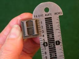
The measurement of type
In the mid-1700’s, a French printer and typographer named Pierre Fournier le Jeune standardized the system of measuring typefaces. It was referred to as the Pica system of measurement and became widely used in England and America. Type sizes were (and still are) measured in points. Type was cast in lead, and was sized relative to one inch. The lead pieces for one line of text had to line up evenly along the top and bottom of the pieces. The size of the text is measured from the top-most ascender to the bottom-most descender of all the letters within a typeface. The one inch measurement is divided into 72 points, and the common 12-point size is one pica, or one-sixth of an inch. The fonts below are all 28 points in size. The top and bottom lines show the outer limits of the ascenders and descenders in the fonts. The fonts shown are Century Gothic, Adobe Caslon Pro, and Edwardian Script ITC.
|
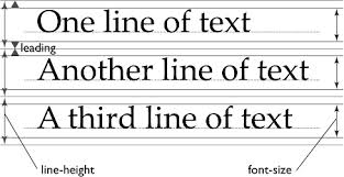
The measurement of line spacing
The spacing from one line of text to the next — from baseline to baseline — is called leading (pronounced “ledding”), because blank pieces of lead were used to create spacing between lines of type. These pieces were also measured in points, and were added to the font size to get the total for the leading size. For example, a 12-point font plus a 3-point spacer equals a leading of 15 points. This is a more exact way of spacing lines of text, compared to our more simple Single or Double spacing methods today. Exact control of the leading allows for more flexibility in typesetting and page layout, depending on the particular typeface used and the font size. |
Measuring the body height within fonts
Another important font measurement is the x-height, or the body height. The body height is the main part of the lowercase letters exclusive of any ascenders or descenders, the part of the letter between the baseline and the “waistline” of the font. This is measured on the lowercase x, which is the most exact letter to determine this measurement, compared to the rest of the letters. The space from the baseline of the x to the top of the x is called the x-height. The purpose of the x-height is to determine the readability of a font. There is no specific unit of measure. Rather, x-heights are considered small, medium or large. Some fonts have a larger x-height than others, which can make them seem larger than other fonts at the same font size. The readability of a font can determine its usage fora particular audience. Fonts with large x-heights are typically used for children’s books, since children can recognize the letters more easily. Fonts with medium x-heights are used for most material read by adults. Script fonts often have a small x-height, because the flourishes of the ascenders and descenders are quite long compared to the body height. These are often seen on cards and invitations, and need to be used at a larger size than Roman-style fonts to improve readability. The fonts below are all at 28 point size. The colored dashed lines show the x-height of each font across the whole line, so you can compare it to the other fonts. The x-height of the first font is nearly twice the size of the last font. The fonts shown are Century Gothic, Adobe Caslon Pro, and Edwardian Script ITC. To get the x-height on the fonts above to be the same across the whole line, the fonts below are set at 28 points, 35 points, and 55 points, respectively. This shows how much font size needs to increase when using fonts with smaller x-heights. |
Handwriting font sizes
Handwriting fonts are subject to the same rules as regular fonts when it comes to font size. Each handwriting font is unique, and will have its own x-height and its own optimum size (the size it is best used at). Some fonts will have a large x-height and can be read well at smaller sizes, while other fonts will have small x-heights and need to be used at larger sizes. The fonts below are the Ready-Made Styles Michael, Aldo and Dave, all at 30-point size. Again, the colored dashed lines demonstrate the difference in x-heights on the same line of text. The Michael font has an x-height that is nearly equal to the height of capitals. As you can see in the example above, natural handwriting fonts are not uniform in size from one letter to the next, so the x-height is more relative than exact. The Dave font has much longer ascenders and descenders compared to the first two fonts, and appears very small next to them. The fonts below are shown at 25 points, 33 points, and 65 points, respectively, so that the x-height is nearly the same across the whole line. |
What size should I use for my handwriting font?
All fonts are the same Size at at the same point specification, like 12-point. But handwriting fonts may not be legible at that size. If the ascenders and descenders are really long, then the body size, or x Height (distance between the Baseline and the Midline), will be a much smaller percentage of the total font Size. That’s the way people really write.
For example, even if you specify 12-point in the Dave handwriting font, the ascenders and descenders will fit in 12-point, but the “a”s and “e”s in the body of the font will look like they’re 3-point – much smaller than people really write because it can’t be easily written or read. A 12-point Helvetica would typically have about a 9-point x height. The x height of Helvetica is about 70% the font size. The x height of the Dave font is about 25% of the font size.
So to make a some handwriting fonts look as readable as 12 point Helvetica, the x height needs to be the same as Helvetica. To make the x height the same in the Dave font, triple the size to 36 point, so that the “a”s and “e”s will look like they’re part of a 12-point font. Then overlap the ascenders and descenders by reducing the line spacing. This is what we do in real handwriting because otherwise the line spacing would then be too big. Amazingly, it will look like a 12-point font because the x height is the same as an “engineered” font like Helvetica.
When using your own font, or one of the Ready-Made Styles, you should use it at a size that approximates real handwriting, not at the size you would use a text font (such as Arial or Times New Roman). Remember that long ascenders and descenders are factored into the font size. Consider the x-height, or body height, of the handwriting. Most handwriting has a body height that is between 1/8 inch and 1/4 inch tall, so any ascenders and descenders extend beyond that, and add to the total size. Consider also that font size is based on 72 points per inch, so you can calculate font size accordingly. If the natural handwriting size for a particular font is about 1/2 inch from the very top to the very bottom, then the font size should be 36 points (1/2 of 72). If the natural size is about 1/4 inch total, then the font size is 18 points (1/4 of 72). For the handwriting styles used above, the natural size for Michael is 22 points, for Aldo is 23 points, and for Dave is 36 points.
MAILING TIP: If you are using a handwriting font for envelopes, remember the US Post Office rule of thumb: a hand-addressed envelope should be readable when held at arm’s length by a postal carrier. |


 se of the x-height is to determine the readability of a font. There is no specific unit of measure. Rather, x-heights are considered small, medium or large. Some fonts have a larger x-height than others, which can make them seem larger than other fonts at the same font size. The readability of a font can determine its usage fora particular audience. Fonts with large x-heights are typically used for children’s books, since children can recognize the letters more easily. Fonts with medium x-heights are used for most material read by adults. Script fonts often have a small x-height, because the flourishes of the ascenders and descenders are quite long compared to the body height. These are often seen on cards and invitations, and need to be used at a larger size than Roman-style fonts to improve readability. The fonts below are all at 28 point size. The colored dashed lines show the x-height of each font across the whole line, so you can compare it to the other fonts. The x-height of the first font is nearly twice the size of the last font. The fonts shown are Century Gothic, Adobe Caslon Pro, and Edwardian Script ITC.
 As you can see in the example above, natural handwriting fonts are not uniform in size from one letter to the next, so the x-height is more relative than exact. The Dave font has much longer ascenders and descenders compared to the first two fonts, and appears very small next to them. The fonts below are shown at 25 points, 33 points, and 65 points, respectively, so that the x-height is nearly the same across the whole line.
 For example, even if you specify 12-point in the Dave handwriting font, the ascenders and descenders will fit in 12-point, but the “a”s and “e”s in the body of the font will look like they’re 3-point – much smaller than people really write because it can’t be easily written or read. A 12-point Helvetica would typically have about a 9-point x height. The x height of Helvetica is about 70% the font size. The x height of the Dave font is about 25% of the font size.